Let’s make the coolest button ever using HTML and CSS
Why should we bother about our button design? The answer is very simple. Great-looking buttons should attract our customers to click on them and go shopping or checkout page.
Today I will present you with an awesome-looking button with great animation, not like buttons we can see all over the internet.
If you want to just take a source code you can scroll to the bottom of the post and grab that bastard.
Also if you rather want to watch a tutorial, I’ll post it just under this text.
HTML part
We do have not so many things to explain here. In the header, we have included a path to our stylesheet.
In the body, we have a div with a class of containers and an anchor with a class of btn inside it.
You can grab the whole HTML down below.
<!DOCTYPE html>
<html lang="en">
<head>
<meta charset="UTF-8">
<meta name="viewport" content="width=device-width, initial-scale=1.0">
<title>Cool Btn</title>
<link rel="stylesheet" href="style.css">
</head>
<body>
<div>
<a href="#">Our cool button</a>
</div>
</body>
</html>
CSS part
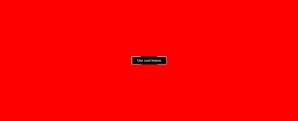
The div with a class of container is here only to add background color, to add some space using padding, and to center the button using flex property.
.container {
background-color: red;
padding: 300px;
display: flex;
justify-content: center;
}
Our button has white text color, we have removed the underline by setting text-decoration to none, and the font size is 20px but you can set it bigger or smaller as you wish.
To add some space between text and button border, we added padding of 10px to the top and the bottom, and 20px to the left and right. For the curved edges, we have added border-radius 2px. The background color of our button is white but this will be changed using CSS pseudo-elements.
We need to set the z-index to 0 and overflow to hidden. Z-index is used to specify the order of elements, while the overflow is used to clip some parts of our element we don’t want to see.
The last thing in our basic styling for the button is to add a position relative who serves us to control the behavior of CSS before and after pseudo-elements.
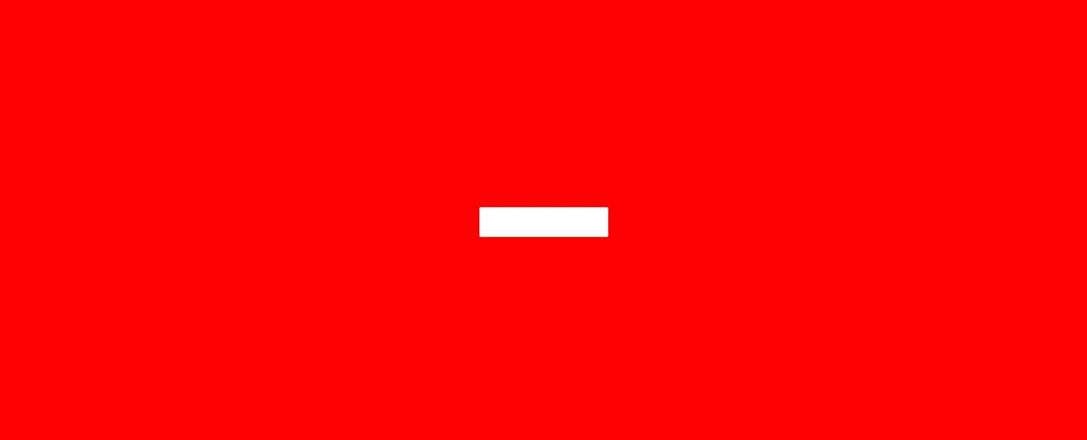
This is what our button looks like right now.
Our next step is to add before and after pseudo-elements.
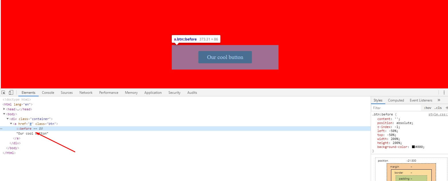
Let’s start with before pseudo-element. First, we need to initialize before pseudo-element by setting content to empty quotes and setting position to absolute. CSS content property is used to insert generated content in pseudo-elements but in this case, we will work with a background color that’s why we set it empty. It has to be initialed to work. Position absolute is used to manipulate the position of pseudo-elements. Z-index is set to -1 to be under the parent btn element.
The size of the before the element is set to be 200% of the parent element, the background is black. If we save and look at our button we will see that it is black now. But because we have set parent element overflow to hidden it is the same size. If we inspect the element and check before the pseudo-element we will see that its size is 2x bigger.
Lastly, let’s add animation property with animation name, animation speed, and animation timing function and set the animation to infinite. This animation we will make later.
.btn:before {
content: '';
position: absolute;
z-index: -1;
left: -50%;
top: -50%;
width: 200%;
height: 200%;
background-color: #000;
animation: animate-btn 4s linear infinite;
-webkit-animation: animate-btn 4s linear infinite;
}
Content, background color, position, and z-index are the same for after pseudo-element like before pseudo-element.
After pseudo-element will help us to manipulate the white border. The size of the after pseudo-element is 5px smaller than the parent btn element because we want to show the white border around the button and set the position from the top and left 2.5px to the center pseudo-element.
When we save this notice nothing happened, because before pseudo-element overlapped after pseudo-element but we will change this by adding animation. With animation, we will spin ours before pseudo-element.
.btn:after {
content: '';
position: absolute;
background-color: #000;
z-index: -1;
left: 2.5px;
top: 2.5px;
width: calc(100% - 5px);
height: calc(100% - 5px);
}
Making the animation
To make the animation we will use the keyframes rule. The animation-name will be animate-btn, the name we have included before pseudo-element. Our animation will work on how we specify our before pseudo-element rotation angle at the start of an animation(0%), on 50% of animation time, and so on.
@keyframes animate-btn {
0% {
transform: rotate(0deg);
-webkit-transform: rotate(0deg);
-moz-transform: rotate(0deg);
-ms-transform: rotate(0deg);
-o-transform: rotate(0deg);
}
50% {
transform: rotate(180deg);
-webkit-transform: rotate(180deg);
-moz-transform: rotate(180deg);
-ms-transform: rotate(180deg);
-o-transform: rotate(180deg);
}
75% {
transform: rotate(270deg);
-webkit-transform: rotate(270deg);
-moz-transform: rotate(270deg);
-ms-transform: rotate(270deg);
-o-transform: rotate(270deg);
}
100% {
transform: rotate(360deg);
-webkit-transform: rotate(360deg);
-moz-transform: rotate(360deg);
-ms-transform: rotate(360deg);
-o-transform: rotate(360deg);
}
}
After making the animation everything should work perfectly and you should have your awesome-looking button.
The download link is under this text.