Today I will show you have to make this booking form using HTML and CSS. This will not be a long tutorial so stick with me. I have added the video underneath if you rather want to watch a video then a written tutorial. You can download source code from the bottom of the website.
First, we need to set up an HTML. At the top of the HTML file, we need to include a path to the CSS and to the font.
<!DOCTYPE html>
<html lang="en">
<head>
<meta charset="UTF-8">
<title>Booking</title>
<link rel="stylesheet" href="css/style.css">
<!-- Font -->
<link href="https://fonts.googleapis.com/css?family=Raleway:400,600,700,900" rel="stylesheet">
</head>
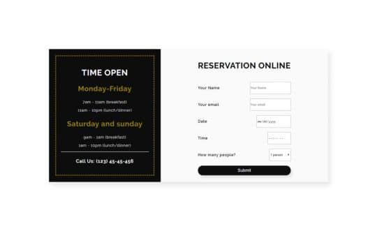
After that, we need to add a visible part of HTML document. It’s consists of two parts. The first part is .container-time(black) and second is .container-form. We have put them in the main div with a class of container.
In the container time div, we have a few headings and paragraphs tags, while in the container-form div is a form with required fields.
You can grab a complete HTML document under this text.
<!DOCTYPE html>
<html lang="en">
<head>
<meta charset="UTF-8">
<title>Booking</title>
<link rel="stylesheet" href="css/style.css">
<!-- Font -->
<link href="https://fonts.googleapis.com/css?family=Raleway:400,600,700,900" rel="stylesheet">
</head>
<body>
<div>
<div>
<h2>Time Open</h2>
<h3>Monday-Friday</h3>
<p>7am - 11am (breakfast)</p>
<p>11am - 10pm (lunch/dinner)</p>
<h3>Saturday and sunday</h3>
<p>9am - 1am (breakfast)</p>
<p>1am - 10pm (lunch/dinner)</p>
<hr>
<h4>Call Us: (123) 45-45-456</h4>
</div>
<div>
<form action="#">
<h2>Reservation Online</h2>
<div>
<p>Your Name</p>
<input type="text" placeholder="Your Name">
</div>
<div>
<p>Your email</p>
<input type="email" placeholder="Your email">
</div>
<div>
<p>Date</p>
<input type="date">
</div>
<div>
<p>Time</p>
<input type="time">
</div>
<div>
<p>How many people?</p>
<select name="select" id="#">
<option value="1">1 person</option>
<option value="2">2 persons</option>
<option value="3">3 persosn</option>
<option value="4">4 persons</option>
<option value="5">5 persons</option>
<option value="5+">5+ persons</option>
</select>
</div>
<button>Submit</button>
</form>
</div>
</div>
</body>
</html>
CSS code
In the body, we have basic styles, font-family, font-weight, color, and letter spacing. Font size is 16px by default.
body {
font-family: 'Raleway', sans-serif;
font-weight: 400;
color: #fff;
letter-spacing: 1px;
}
Our main container has a slightly darken background color then our body element so we can see the difference. We have added a 200px margin for space from all sides. If you want you can center it using margin: 0 auto.
To get the effect of the offset element, we added a shadow to the container and to put our container-time and container-form elements horizontally we set the display to the grid.
The black part is 40% of the container and grey is 60% for that we have used grid template columns.
.container {
background-color: #fafafa;
margin: 200px;
box-shadow: 10px 15px 20px rgba(0, 0, 0, .1);
display: grid;
grid-template-columns: 40% 60%;
}
container-time has a black background.
We have added padding to this element to make some room for the elements inside.
For the border, we have used an outline CSS property not a border.
To move the outline inside we use outline-offset CSS property and we have aligned text to the center.
.container-time {
background-color: rgba(0, 0, 0, .95);
padding: 50px;
outline: 3px dashed #998100;
outline-offset: -30px;
text-align: center;
}
Our next step is to increase the font size, change colors, and transform our headings to uppercase.
.heading {
font-size: 35px;
text-transform: uppercase;
}
.heading-days {
color:#998100;
font-size: 30px;
}
.heading-phone {
font-size: 20px;
}
Our form container has a padding 20px to the top and bottom, and 0 for the right and left.We have centered it setting margin 0 from top and bottom and auto from the right and left.
.container-form {
padding: 20px 0;
margin: 0 auto;
color: #000;
}
Let’s style our form.
Inside our form, we have heading element and div’s with a class of form-field, to make space between these elements we set the form display to grid and grid-row-gap to 20px.
form-field have a paragraph and input field, to make them be at the ends and to be a blank space between, we used flexbox properties.
To make some space we add padding to input and select fields.
form {
display: grid;
grid-row-gap: 20px;
}
form p {
font-weight: 600;
}
.form-field {
display: flex;
justify-content: space-between;
}
input,select {
padding: 10px 15px;
}
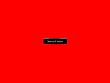
Last is our button element.
Apart from self-explanatory CSS property, border-radius is set to high number to accomplish the pretty curved border.
Same as on the container element we have added a shadow to accomplish the effect of offset element. Transition is how fast will our grow when we hover on it. On the hover state, we increase the size of our button using the transform property.
The box-shadow is slightly lighter as well.
.btn {
background-color: rgba(0, 0, 0, .95);
color: #fff;
padding: 10px 20px;
border: none;
font-size: 18px;
border-radius: 100px;
-webkit-border-radius: 100px;
-moz-border-radius: 100px;
-ms-border-radius: 100px;
-o-border-radius: 100px;
box-shadow: 7px 10px 12px rgba(0, 0, 0, .1);
cursor: pointer;
transition: all .3s;
-webkit-transition: all .3s;
-moz-transition: all .3s;
-ms-transition: all .3s;
-o-transition: all .3s;
}
.btn:hover {
transform: scale(1.03);
-webkit-transform: scale(1.03);
-moz-transform: scale(1.03);
-ms-transform: scale(1.03);
-o-transform: scale(1.03);
box-shadow: 10px 12px 15px rgba(0, 0, 0, .3);
}
I hope you have enjoyed our content for more content like this please subscribe to our website and youtube channel.
Hi, really stupid question, but what happens with the data when the customer clicks on submit?
Nothing. Because this is just a UI design.