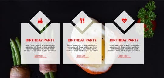
Cards are very important in website design nowadays because they have a lot of interactive content and information about the products, etc. Knowing how to make them will surely help you to polish your website design.
Today we will make some awesome-looking cards using HTML and CSS with minimum use of code. To achieve this we will use a CSS grid layout system. We will also use some cool CSS properties to cut some pieces of design.
If you prefer a video over a written tutorial you can watch it down below.
The source code for this card will be at the bottom of the page.
HTML Part
Let’s begin with HTML first. On the top of our HTML boilerplate include path to CSS, google font and to the font awesome.
We will need font-awesome for icons at the top of the card.
<!DOCTYPE html>
<html lang="en">
<head>
<meta charset="UTF-8">
<title>Card</title>
<!-- Custom style -->
<link rel="stylesheet" href="css/style.css">
<!-- Font -->
<link href="https://fonts.googleapis.com/css2?family=Raleway&display=swap" rel="stylesheet">
<!-- Font Awesome -->
<link rel="stylesheet" href="https://use.fontawesome.com/releases/v5.8.2/css/all.css" integrity="sha384-oS3vJWv+0UjzBfQzYUhtDYW+Pj2yciDJxpsK1OYPAYjqT085Qq/1cq5FLXAZQ7Ay" crossorigin="anonymous">
</head>
In our body, we have a container that serves us to adjust the space around the cards and to make a layout. For the layout, we will use the CSS grid. I will explain how we will set it up later in the CSS part of the tutorial.
Inside the container, we have 3 cards. Cards consist of two parts: card-top and card-body. Inside card-top is the icon, and inside card-body is the text and the button.
Here is the whole HTML file:
<!DOCTYPE html> <html lang="en"> <head> <meta charset="UTF-8"> <title>Card</title> <!-- Custom style --> <link rel="stylesheet" href="css/style.css"> <!-- Font --> <link href="https://fonts.googleapis.com/css2?family=Raleway&display=swap" rel="stylesheet"> <!-- Font Awesome --> <link rel="stylesheet" href="https://use.fontawesome.com/releases/v5.8.2/css/all.css" integrity="sha384-oS3vJWv+0UjzBfQzYUhtDYW+Pj2yciDJxpsK1OYPAYjqT085Qq/1cq5FLXAZQ7Ay" crossorigin="anonymous"> </head> <body> <div> <div> <div> <i></i> </div> <div> <h1>Birthday Party</h1> <p>Lorem ipsum dolor sit amet, consectetur adipisicing elit. Sequi veritatis architecto enim consequatur, assumenda ipsum molestiae nemo, amet voluptas aspernatur.</p> <a href="#">Book Now →</a> </div> </div> <div> <div> <i></i> </div> <div> <h1>Birthday Party</h1> <p>Lorem ipsum dolor sit amet, consectetur adipisicing elit. Sequi veritatis architecto enim consequatur, assumenda ipsum molestiae nemo, amet voluptas aspernatur.</p> <a href="#">Book Now →</a> </div> </div> <div> <div> <i></i> </div> <div> <h1>Birthday Party</h1> <p>Lorem ipsum dolor sit amet, consectetur adipisicing elit. Sequi veritatis architecto enim consequatur, assumenda ipsum molestiae nemo, amet voluptas aspernatur.</p> <a href="#">Book Now →</a> </div> </div> </div> </body> </html>
CSS
In the body element, we have included our font, we have reset our HTML with the margin set to 0, and we have included border, padding, and margin in the total size of the body element by setting box-sizing to border-box.
body {
font-family: 'Raleway', sans-serif;
margin: 0;
-webkit-box-sizing: border-box;
-moz-box-sizing: border-box;
box-sizing: border-box;
}
In the div with the class, we have set how will our layout look and background image.
The background-size is cover to cover the whole element, and background-repeat is set to no-repeat to not repeat.
The layout is dictated by the CSS grid. In order to achieve the responsive design we have set: grid-template-columns: repeat(auto-fit, min-max (350px, 1fr)).
This means that the columns will repeat and auto-fit with minimal width of 350px, and maximal width of 1fr.
1fr stands for one part of the available space.
Grid-column-gap is the space between cards on the horizontal axis, grid-row-gap is space between cards on the vertical axis. We need to add a grid-row-gap for the mobile layout. If we don’t do that then cards will overlap each other.
And lastly, padding is for some space around cards.
.container {
background-image: url('../img/cover.jpg');
background-size: cover;
background-repeat: no-repeat;
display: grid;
grid-template-columns: repeat(auto-fit, minmax(350px, 1fr));
grid-column-gap: 30px;
grid-row-gap: 150px;
padding: 200px;
}
To move the top of the card(icon) in the center on the horizontal axis we will set card display to the grid, and align-items to center. We will also add the position property and set it to the relative in order to move the card top element to the top -120px.
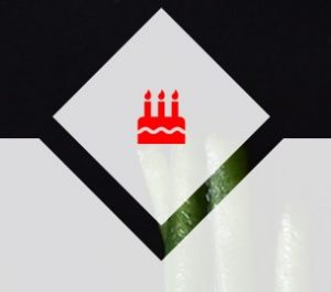
Card top
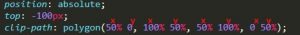
The width and height of this element are 200px. The position property is set to absolute because the card position is relative and we will move this element according to the parent element in this case .card.
Card-top currently looks like this
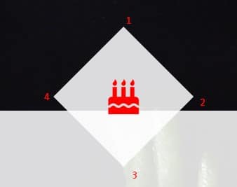
So how we gonna achieve that skewed look? We will use the clip-path property.
With clip-path property, we decide which parts to shown and which do not show. In this case, we will use clip-path with the value of polygon(). Inside these parentheses, we add x and y coordinates. For example clip-path: polygon(40% 100%), this means the x coordinate is on 40% and we will see what is between 0 and 40% rest will be clipped, while for the y is 100% and we will see the whole element on the y-axis.
Our clip-path is clip-path: polygon(50% 0, 100% 50%, 50% 100%, 0 50%);
First value: x is 50% from the left and Y is 0% from the top.
Second is X 100% from left, Y 50% from the top, and so on.
We have added a background color, moved the element to the top 100px and centered icon using the CSS grid layout. To change the color of the icon we use font awesome icon class.
.card-top {
width: 200px;
height: 200px;
background-color: rgba(255, 255, 255, .85);
position: absolute;
top: -120px;
clip-path: polygon(50% 0, 100% 50%, 50% 100%, 0 50%);
display: grid;
justify-content: center;
align-items: center;
}
.fas {
color: red;
font-size: 50px;
}
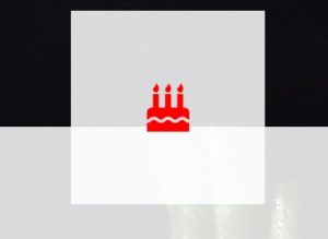
Next is a card-body element. We have added some space to the elements inside the card-body by adding padding. 80px to the top, 30px to the right and left, and 70px to the bottom. Text aligns to the center.
We also need to add a clip-path property to this element. The easiest way to achieve precise numbers is to put some initial numbers and open developer tools and increase and decrease numbers like this:
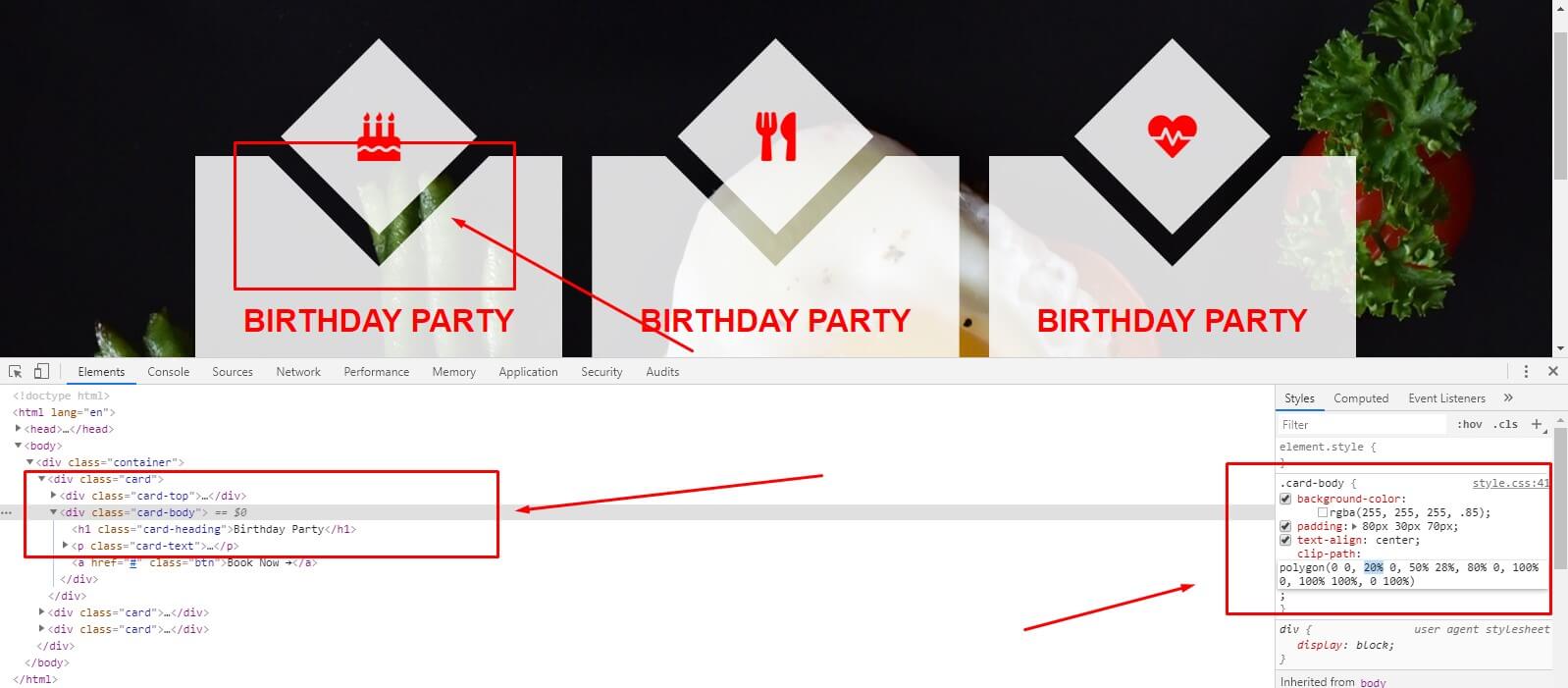
.card-body {
background-color: rgba(255, 255, 255, .85);
padding: 80px 30px 70px;
text-align: center;
clip-path: polygon(0 0, 20% 0, 50% 28%, 80% 0, 100% 0, 100% 100%, 0 100%);
}
We have transformed our heading to uppercase and added a margin to the top because we have moved our card-top to the top.
The card text is also moved a little bit to the bottom using the margin.
.card-heading {
color: red;
margin-top: 70px;
text-transform: uppercase;
}
.card-text {
margin-bottom: 30px;
}
The underline for the button was removed setting the text-decoration property to none. The text color for the button is red, space around the text in the button is adjusted by padding.
The nice border on the bottom is set by the border-bottom property. We have used the transition property to set the speed of the hover state for the button.
On hover our button becomes red and the text color changes to white.
.btn {
color: red;
text-decoration: none;
border-bottom: 2px solid red;
padding: 5px 10px;
font-size: 18px;
transition: all .3s;
}
.btn:hover {
background-color: red;
color: #fff;
}
The only thing we need to set up in order to achieve our cards to be mobile responsive is to decrease padding on our container div and maybe you will need to change card-body clip-path values a little bit depending on what is the width of your device.
@media screen and (max-width: 768px) {
.container {
padding: 100px 5px;
}
.card-body {
clip-path: polygon(0 0, 20% 0, 50% 25%, 80% 0, 100% 0, 100% 100%, 0 100%);
}
}