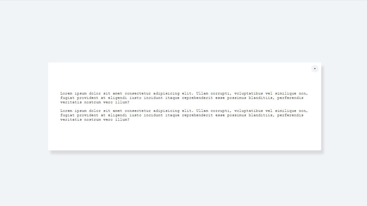
People tend to use bootstrap or a similar library or framework for simple stuff like modals and give some additional weight to the unnecessary web pages.
I will show you today how is simple to make a modal using HTML, CSS, and vanilla JS.
1. So let’s begin with the HTML:
<!DOCTYPE html> <html lang="en"> <head> <meta charset="UTF-8"> <meta http-equiv="X-UA-Compatible" content="IE=edge"> <meta name="viewport" content="width=device-width, initial-scale=1.0"> <title>Modal</title> <link rel="stylesheet" href="style.css"> <script src="script.js" defer></script> </head> <body> <main> <button>Click me</button> <div class="modal" id="modal"> <p>Lorem ipsum dolor sit amet consectetur adipisicing elit. Recusandae nam, explicabo nulla voluptatibus omnis iste ipsam sunt ea non. Quidem mollitia temporibus voluptates dolorum voluptas sunt libero sapiente, repellat ipsam.</p> <span id="close-modal">×</span> </div> </main> </body> </html>
This is a basic HTML skeleton.
We have included the path to CSS and the script in the head of the file.
Inside the body element, we have added the main element, and then we have added a button and div with a class of modal where the content will be placed.
There is also a span element inside the modal div which we will use for closing(hiding) the modal.
2. CSS
We give a background color to the body and a font family for our document.
body {

    background-color: #f1f4f7;
    font-family: 'Courier New', Courier, monospace;

}
We have given height to the main element so we can use a CSS grid layout to easily center the button and modal inside it.
Justify-content: center aligns content in the center of the div on the X-axis and align-content: center aligns items in the center of the div on the Y-axis.
main {

    height: 100vh;

    display: grid;

    justify-content: center;

    align-content: center;

}
Let’s style our button next.
First, we will give the width to it doesn’t occupy the whole available width, and add some padding to give some space around the text.
Next, we will give background color, and color for the text, remove the border and change the cursor to the pointer so the visitors know that the button is clickable.
button {

    width: 150px;

    padding: 10px 15px;

    border: none;

    background-color: blueviolet;

    color:#fff;

    border-radius: 3px;

    -webkit-border-radius: 3px;

    -moz-border-radius: 3px;

    -ms-border-radius: 3px;

    -o-border-radius: 3px;

    cursor: pointer;

}
We have added white background and box-shadow to the modal, we also give it a width to center it nicely.
To make some room between the text and edges of the modal div we add some padding.
To make the transition between showing and hiding modal we must make an animation using keyframes. For now, let’s add an animation name and animation duration for the modal div.
We also need to add a position relative to the modal div so that we could move the span with X to the desired position.
.modal {

    max-width: 1000px;

    padding: 100px 50px;

    background-color: #fff;

    box-shadow: 10px 15px 10px rgba(0, 0, 0, .1);

    position: relative;

    display: none;

    animation: modal-open .3s;

    -webkit-animation: modal-open .3s;

}
Our next step is to position the span to the top right, for that we gonna use the position absolute, set it to from the top to be 10px, and from the right 10px.
We also will give it a background color, height, width, and border-radius so it looks like a circle. To move the HTML entity (X) to the center we must align text to the center for the x-axis and give the line-height the same as the height of the element so that the HTML entity is centered on the y-axis.
Cursor: pointer is given so the element looks like is clickable.
span {

    position: absolute;

    top: 10px;

    right: 10px;

    background-color: #f1f4f7;

    width: 30px;

    height: 30px;

    border-radius: 50%;

    -webkit-border-radius: 50%;

    -moz-border-radius: 50%;

    -ms-border-radius: 50%;

    -o-border-radius: 50%;

    text-align: center;

    line-height: 30px;

    cursor: pointer;

}
Last is the animation we have talked about. Our animation dictates the opacity of the element.
@keyframes modal-open {

    0% {

        opacity: 0;

    }

    100% {

        opacity: 1;

    }

}
3. Javascript manipulation
The first thing we need is to access our HTML elements so that we can manipulate them.
Our desired HTML elements are a button, a modal, span, and the main element.
To access the button element we will use the query selector and choose the button. There is only one button in the document so we can use this method to access it.
To access the modal and the span we gonna use the getElementById method because we have IDs for them.
And lastly, for the main element, we gonna use the same method as for the button.
const btn = document.querySelector('button');

const modal = document.getElementById('modal');

const hideModalBtn = document.getElementById('close-modal');

const main = document.querySelector('main');
To show modal to the screen we will add an event listener to the button. When we click on the button function will be fired. Inside the function, we change the style of the button and modal. We will set the display to block for the modal, and display to none for the button to hide it.
const showModal = () => {

    modal.style.display = 'block';

    btn.style.display = 'none';

}

const hideModal = () => {

    modal.style.display = 'none';

    btn.style.display = 'block';

}

btn.addEventListener('click', showModal);

hideModalBtn.addEventListener('click', hideModal);
There is only one thing we should change. When the user clicks on outside the modal to hide it.
To do that we will listen to clicks on the window object. If the click occurs on the main element then the modal style will be changed from the display: block to the display: none;
window.addEventListener('click', (e) => {

    if(e.target == main) {

        modal.style.display = 'none';

        btn.style.display = 'block';

    }

})