Whether you need an admin dashboard for e-commerce, school management, hospital management, job portal, or any other business, this will be the perfect tutorial to learn how to start making one. You will also be able to download the complete source code.
This is a live demo of the final product: Admin Dashboard
Here is what we will learn today:
- How to build a responsive sidebar menu with cool hover effects
- Learn how to make different charts using the chart.js library
- We will also learn how to maximize the usage of bootstrap 5 utility classes, so we don’t need to write much CSS
- And how to make a responsive data table with filtrable options
So let’s begin. We have already made a folder with index.html files, CSS, Javascript, and Images.
Open the index.html and add this code to the top:
<!DOCTYPE html>
<html lang="en">

<head>
    <meta charset="UTF-8">
    <meta http-equiv="X-UA-Compatible" content="IE=edge">
    <meta name="viewport" content="width=device-width, initial-scale=1.0">
    <title>Admin dashboard</title>

    <!-- Bootstrap icons  -->
    <link rel="stylesheet" href="https://cdn.jsdelivr.net/npm/[email protected]/font/bootstrap-icons.css">

    <!-- Bootstrap cdn -->
    <link href="https://cdn.jsdelivr.net/npm/[email protected]/dist/css/bootstrap.min.css" rel="stylesheet"
        integrity="sha384-Zenh87qX5JnK2Jl0vWa8Ck2rdkQ2Bzep5IDxbcnCeuOxjzrPF/et3URy9Bv1WTRi" crossorigin="anonymous">

    <!-- Fonts  -->
    <link rel="preconnect" href="https://fonts.googleapis.com">
    <link rel="preconnect" href="https://fonts.gstatic.com" crossorigin>
    <link href="https://fonts.googleapis.com/css2?family=DM+Sans:wght@400;700&display=swap" rel="stylesheet">

    <!-- Tables css  -->
    <link rel="stylesheet" type="text/css" href="https://cdn.datatables.net/v/bs5/dt-1.12.1/datatables.min.css" />

    <!-- Custom CSS  -->
    <link rel="stylesheet" href="./css/main.css">
</head>

<body>
We have included Bootstrap icons, Boostrap CDN, Fonts, Tables CSS, and custom CSS.
Javascript files go in the bottom of our document:
  <!-- Boostrap 5  -->
        <script src="https://cdn.jsdelivr.net/npm/[email protected]/dist/js/bootstrap.bundle.min.js"
            integrity="sha384-OERcA2EqjJCMA+/3y+gxIOqMEjwtxJY7qPCqsdltbNJuaOe923+mo//f6V8Qbsw3"
            crossorigin="anonymous"></script>
        <!-- jquery  -->
        <script src="https://code.jquery.com/jquery-3.5.1.js"></script>

        <!-- Data tables  -->
        <script type="text/javascript" src="https://cdn.datatables.net/v/bs5/dt-1.12.1/datatables.min.js"></script>

        <!-- Chart js  -->
        <script src="https://cdn.jsdelivr.net/npm/[email protected]/dist/chart.min.js"></script>

        <!-- Custom js  -->
        <script src="./js/main.js"></script>

    </body>

</html>
Here is a link to the bootstrap javascript CDN, jquery, chart.js, and custom javascript file.
Jquery is required for data tables.
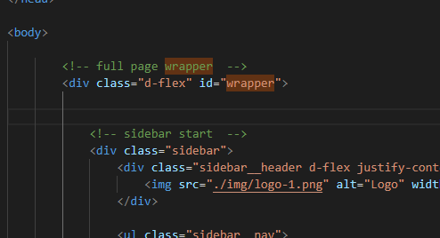
Let’s start with real coding. First, we need to wrap the whole application in one div.
<!-- full page wrapper  -->
        <div class="d-flex" id="wrapper">
d-flex is a bootstrap utility class, which we use to display side navigation and min part side by side. wrapper id will be used by javascript later to toggle navigation.
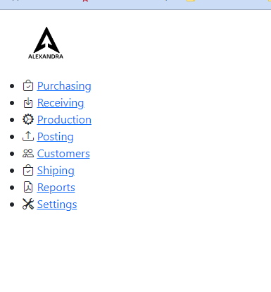
Sidebar
<!-- sidebar start  -->
            <div class="sidebar">
                <div class="sidebar__header d-flex justify-content-center p-4">
                    <img src="./img/logo-1.png" alt="Logo" width="50px">
                </div>
                <ul class="sidebar__nav">
                    <li class="sidebar__list active">
                        <i class="bi bi-bag-check"></i>
                        <a href="index.html" class="sidebar__link">Purchasing</a>
                    </li>
                    <li class="sidebar__list">
                        <i class="bi bi-box-arrow-in-down"></i>
                        <a href="#" class="sidebar__link">Receiving</a>
                    </li>
                    <li class="sidebar__list">
                        <i class="bi bi-gear-wide-connected"></i>
                        <a href="#" class="sidebar__link">Production</a>
                    </li>
                    <li class="sidebar__list">
                        <i class="bi bi-upload"></i>
                        <a href="#" class="sidebar__link">Posting</a>
                    </li>
                    <li class="sidebar__list">
                        <i class="bi bi-people"></i>
                        <a href="#" class="sidebar__link">Customers</a>
                    </li>
                    <li class="sidebar__list">
                        <i class="bi bi-bag-check"></i>
                        <a href="#" class="sidebar__link">Shiping</a>
                    </li>
                    <li class="sidebar__list">
                        <i class="bi bi-file-earmark-pdf"></i>
                        <a href="index.html" class="sidebar__link">Reports</a>
                    </li>
                    <li class="sidebar__list">
                        <i class="bi bi-tools"></i>
                        <a href="index.html" class="sidebar__link">Settings</a>
                    </li>
                </ul>
            </div>
           <!-- Sidebar end  -->
We have added a sidebar class to the side menu so we can use it in CSS later for styling purposes.
On top of the side menu is a logo, to put the logo in the middle we have used bootstrap utility classes:
d-flex, and justify-content-center. To add some more space and to fit the logo nicely We have used the p-4 utility class.
The p-4 class adds padding to all sides, 1.5 rem.
The icons used in navigation are Bootstrap icons, and you can check them here: https://icons.getbootstrap.com/
We will talk more about side navigation when we come to styling.
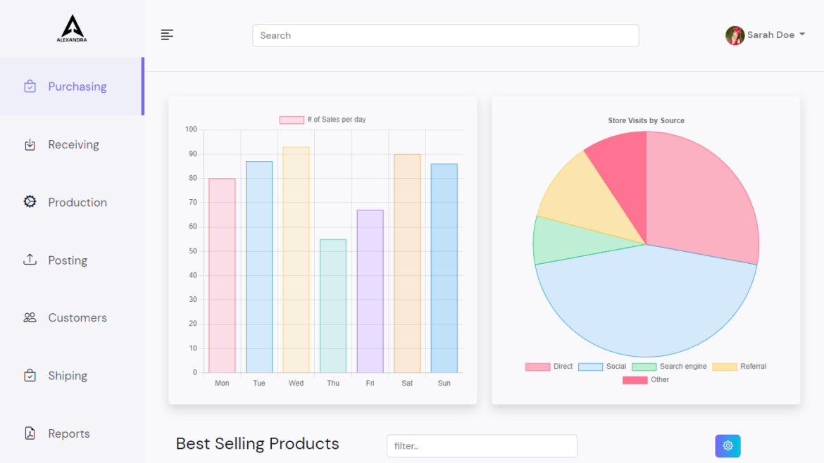
Here is what we build so far:
Our next step is the top navigation. The top navigation will be inside page-content-wrapper because the main content and the top navigation must be in one container, or the content would be side by side with the top navigation.
Remember we have added a d-flex to a top container.
Here is what the code looks like:
<!-- Navbar container  -->
           <div id="page-content-wrapper">
               <!-- Navbar -->
               <nav class="navbar navbar-expand-lg navbar-light bg-transparent p-4 border-bottom">
                   <div>
                       <i class="bi bi-text-left" id="menu-toggle"></i>
                   </div>
                   <button class="navbar-toggler" type="button" data-bs-toggle="collapse"
                       data-bs-target="#navbarSupportedContent" aria-controls="navbarSupportedContent"
                       aria-expanded="false" aria-label="Toggle navigation">
                       <span class="navbar-toggler-icon"></span>
                   </button>
                   <div class="collapse navbar-collapse" id="navbarSupportedContent">
                       <form class="d-flex ms-auto">
                           <input class="form-control me-2 top-search" type="search" placeholder="Search"
                               aria-label="Search">
                       </form>
                       <ul class="navbar-nav ms-auto mb-2 mb-lg-0">
                           <li class="nav-item dropdown">
                               <a class="nav-link dropdown-toggle second-text fw-bold" href="#" id="navbarDropdown"
                                   role="button" data-bs-toggle="dropdown" aria-expanded="false">
                                   <img src="img/girl.jpg" alt="Sarah" class="user-img rounded-circle"> Sarah Doe
                               </a>
                               <ul class="dropdown-menu" aria-labelledby="navbarDropdown">
                                   <li><a class="dropdown-item" href="#">Profile</a></li>
                                   <li><a class="dropdown-item" href="#">Settings</a></li>
                                   <li><a class="dropdown-item" href="#">Logout</a></li>
                               </ul>
                           </li>
                       </ul>
                   </div>
               </nav>
               <!-- End of navbar  -->
We have used the navbar component from here: https://getbootstrap.com/docs/5.2/components/navbar/ and We have edited it to fit our needs.
Instead of the logo, We have added an icon that will be used to toggle on and off the side menu.
In the middle is input with the type of search, and to the right is the user image with options. For the options, We have used a drop-down menu. To move the user image on the right We have used a bootstrap utility class(ms-auto).
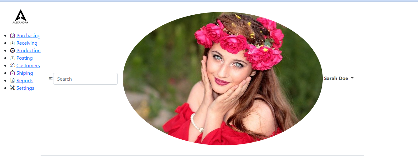
No so great result so far? Don’t worry we will improve it soon.
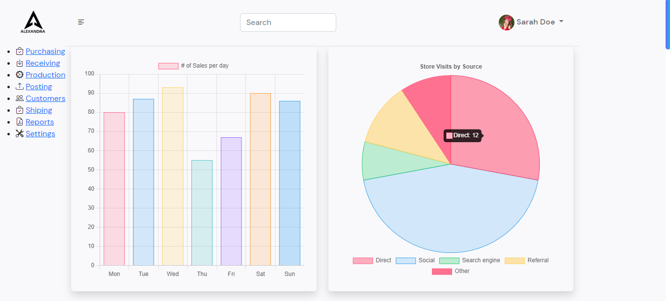
Let’s build charts
<!-- Main part -->
                <div class="container-fluid main-part">
                    <!-- Charts  -->
                    <div class="row">
                        <div class="col-sm-12 col-md-6">
                            <div class="shadow rounded p-4">
                                <canvas id="myChart" width="450" height="450"></canvas>
                            </div>
                        </div>
                        <div class="col-sm-12 col-md-6 ">
                            <div class="shadow rounded p-4">
                                <canvas id="visits" width="450" height="450"></canvas>
                            </div>
                        </div>
                    </div>
                    <!-- End of Charts  -->
This is what we need to add to the HTML to initiate charts. Canvas needs to have an ID so we can work with it inside the javascript file.
Javascript file for Charts.js
const ctx = document.getElementById('myChart').getContext('2d');
const myChart = new Chart(ctx, {
    type: 'bar',
    data: {
        labels: ['Mon', 'Tue', 'Wed', 'Thu', 'Fri', 'Sat', 'Sun'],
        datasets: [{
            label: '# of Sales per day',
            data: [80, 87, 93, 55, 67, 90, 86],
            backgroundColor: [
                'rgba(255, 99, 132, 0.2)',
                'rgba(54, 162, 235, 0.2)',
                'rgba(255, 206, 86, 0.2)',
                'rgba(75, 192, 192, 0.2)',
                'rgba(153, 102, 255, 0.2)',
                'rgba(255, 159, 64, 0.2)',
                'rgba(54, 162, 235, 0.3)'
            ],
            borderColor: [
                'rgba(255, 99, 132, 1)',
                'rgba(54, 162, 235, 1)',
                'rgba(255, 206, 86, 1)',
                'rgba(75, 192, 192, 1)',
                'rgba(153, 102, 255, 1)',
                'rgba(255, 159, 64, 1)',
                'rgba(54, 162, 235, 1)'
            ],
            borderWidth: 1
        }]
    },
    options: {
        scales: {
            y: {
                beginAtZero: true
            }
        }
    }
});
const ctx2 = document.getElementById('visits').getContext('2d');
const visits = new Chart(ctx2, {
  type: 'pie',
  data: {
    labels: ['Direct', 'Social', 'Search engine', 'Referral', 'Other'],
    datasets: [
      {
        label: 'Dataset 1',
        data: [12, 19, 3, 5, 4],
        backgroundColor: [
          'rgba(255, 99, 132, 0.5)',
          'rgba(54, 162, 235, 0.2)',
          'rgba(46, 204, 113, 0.3)',
          'rgba(255, 206, 86, 0.5)',
          'rgba(255, 99, 132, 0.9)',
        ],
        borderColor: [
          'rgba(255,99,132,1)',
          'rgba(54, 162, 235, 1)',
          'rgba(46, 204, 113, 1)',
          'rgba(255, 206, 86, 1)',
          'rgba(255, 99, 132, 1)',
        ],
        borderWidth: 1
      }
    ]
  },
  options: {
    responsive: true,
    plugins: {
      legend: {
        position: 'bottom',
      },
      title: {
        display: true,
        text: 'Store Visits by Source'
      }
    }
  },
});
With a document.getElementById we grab the element from the HTML file we need to work with.
getContext method returns a drawing context on the canvas, and 2d is the context type.
With the new Chart, we initiate the javascript object required for drawing canvas.
The type is a canvas type
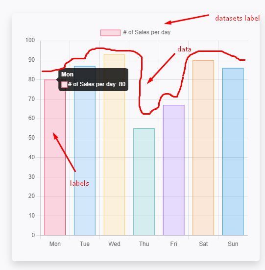
We also can change the position of the legend in options and the title.
For more information please visit https://www.chartjs.org/
Our next step is to make a heading for the table, search input, and a gear icon for the settings on the right.
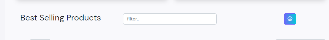
For this part best option is to use a bootstrap utility class.
Container fluid to take the full size of the element, with padding of 1.5rem (p-4) in all directions.
Div with the class of row so we can add columns inside and make it responsive.
For the gear icon, We have added a custom class which I will make later.
The gear icon also has a bootstrap data element – data-bs-toggle and data-bs-target which are used to toggle elements. In this case, it will toggle a modal with a parts ID.
Here is the code:
<!-- Table containar  -->
                   <div class="table-container">
                       <!-- Container  -->
                       <div class="container-fluid py-5">
                           <!-- Row  -->
                           <div class="row align-items-center">
                               <!-- First Column -->
                               <div class="col-sm-12 col-md-4">
                                   <h3 class="table-heading">
                                       Best Selling Products
                                   </h3>
                               </div>
                               <!-- End of first column  -->
                               <!-- Second colum  -->
                               <div class="col-sm-12 col-md-5">
                                   <form class="d-flex">
                                       <input class="form-control me-2" type="search" placeholder="filter..">
                                   </form>
                               </div>
                               <!-- End of second column  -->
                               <!-- Third column  -->
                               <div class="col-sm-12 col-md-2 d-flex justify-content-end">
                                   <!-- Button trigger modal -->
                                   <button type="button" class="btn btn-custom gear-btn" data-bs-toggle="modal"
                                       data-bs-target="#parts">
                                       <i class="bi bi-gear"></i>
                                   </button>
                                   <!-- End of button  -->
                               </div>
                               <!-- End of third colum  -->
                           </div>
                           <!-- End of row  -->
                       </div>
                       <!-- End of Container  -->
Responsive Data Table
For the data tables, we have used an open-source project, this example: https://datatables.net/examples/basic_init/zero_configuration.html
Here is the complete code:
<table id="example" class=" bg-white rounded shadow-sm table-hover" style="width: 100%;">
                           <thead>
                               <tr>
                                   <th>Product ID</th>
                                   <th>Product image</th>
                                   <th>Title</th>
                                   <th>Price</th>
                                   <th>Action</th>

                               </tr>
                           </thead>
                           <tbody>

                               <tr>
                                   <td> #12345 </td>
                                   <td>
                                       <img src="img/1.jpg" alt="product 1" class="product-img">
                                   </td>
                                   <td>Product 1</td>
                                   <td>$1200</td>
                                   <td class="text-center">
                                       <a href="#"><i class="bi bi-pencil-square" data-bs-toggle="modal"
                                               data-bs-target="#parts"></i></a>
                                       <a href="#"><i class="bi bi-trash text-danger"> </i> </a>
                                   </td>

                               </tr>

                               <tr>
                                   <td> #12345 </td>
                                   <td><img src="img/2.png" alt="product-2" class="product-img"></td>
                                   <td>Product 2</td>
                                   <td>$750</td>
                                   <td class="text-center">
                                       <a href="#"><i class="bi bi-pencil-square" data-bs-toggle="modal"
                                               data-bs-target="#parts"></i></a>
                                       <a href="#"><i class="bi bi-trash text-danger"> </i> </a>
                                   </td>
                               </tr>
                               <tr>
                                   <td> #12345 </td>
                                   <td><img src="img/3.jpg" alt="product-1" class="product-img"></td>
                                   <td>Product 3</td>
                                   <td>$100</td>
                                   <td class="text-center">
                                       <a href="#"><i class="bi bi-pencil-square" data-bs-toggle="modal"
                                               data-bs-target="#parts"></i></a>
                                       <a href="#"><i class="bi bi-trash text-danger"> </i> </a>
                                   </td>
                              </tr>
                               <tr>
                                   <td> #12345 </td>
                                   <td><img src="img/4.jpg" alt="product-4" class="product-img"></td>
                                   <td>Product 4</td>
                                   <td>$300</td>
                                   <td class="text-center">
                                       <a href="#"><i class="bi bi-pencil-square" data-bs-toggle="modal"
                                               data-bs-target="#parts"></i></a>
                                       <a href="#"><i class="bi bi-trash text-danger"> </i> </a>
                                   </td>
                               </tr>
                               <tr>
                                   <td> #12345 </td>
                                   <td><img src="img/5.jpg" alt="product-5" class="product-img"></td>
                                   <td>Product 5</td>
                                   <td>$120</td>
                                   <td class="text-center">
                                       <a href="#"><i class="bi bi-pencil-square" data-bs-toggle="modal"
                                               data-bs-target="#parts"></i></a>
                                       <a href="#"><i class="bi bi-trash text-danger"> </i> </a>
                                   </td>

                               </tr>

                               <tr>
                                   <td> #12345 </td>
                                   <td><img src="img/6.jpg" alt="product-6" class="product-img"></td>
                                   <td>Product 6</td>
                                   <td>$1800</td>
                                   <td class="text-center">
                                       <a href="#"><i class="bi bi-pencil-square" data-bs-toggle="modal"
                                               data-bs-target="#parts"></i></a>
                                       <a href="#"><i class="bi bi-trash text-danger"> </i> </a>
                                   </td>

                               </tr>

                               <tr>
                                   <td> #12345 </td>
                                   <td><img src="img/8.jpg" alt="product-7" class="product-img"></td>
                                   <td>Product 7</td>
                                   <td>$75</td>
                                   <td class="text-center">
                                       <a href="#"><i class="bi bi-pencil-square" data-bs-toggle="modal"
                                               data-bs-target="#parts"></i></a>
                                       <a href="#"><i class="bi bi-trash text-danger"> </i> </a>
                                   </td>
                               </tr>
                           </tbody>
                       </table>

                   </div>
                   <!-- Table Container End -->
Table id is used in javascript to manipulate it. Classes are from the bootstrap just to style it.
Javascript for the tables:
 // Tables sorting
  $(document).ready(function() {
    $('#example').DataTable( {
        "scrollX": true
    } );
} );
The pencil icon inside the table will also trigger the modal same as the gear icon from the top.
Modal is the last element we need to make with HTML.
We have copied the modal component from the bootstrap documentation and edited it according to our needs. https://getbootstrap.com/docs/5.2/components/modal/#how-it-works
Here is the code:
<!-- Modal -->
                   <div class="modal fade bd-example-modal-lg" id="parts" tabindex="-1"
                       aria-labelledby="exampleModalLabel" aria-hidden="true">
                       <div class="modal-dialog modal-lg">
                           <div class="modal-content">
                               <div class="modal-header">
                                   <h5 class="modal-title" id="exampleModalLabel">Vendor / Supplies parts</h5>
                                   <button type="button" class="btn-close" data-bs-dismiss="modal"
                                       aria-label="Close"></button>
                               </div>
                               <div class="modal-body">


                                   <div class="row mb-2">
                                       <div class="col-md-3">
                                           <label class="form-label">Product ID</label>
                                       </div>

                                       <div class="col-md-9">
                                           <select class="form-select">
                                               <option selected disabled value="">#12345</option>
                                               <option>#12345</option>
                                               <option>#12345</option>
                                               <option>#12345</option>
                                               <option>#12345</option>
                                               <option>#12345</option>
                                               <option>#12345</option>
                                               <option>#12345</option>
                                               <option>#12345</option>
                                           </select>
                                       </div>
                                   </div>
                                   <div class="row mb-2">
                                       <div class="col-md-3">
                                           <label class="form-label">Image URL</label>
                                       </div>

                                       <div class="col-md-9">
                                           <input type="text" class="form-control" value="https://www.google.com/">
                                       </div>
                                   </div>

                                   <div class="row mb-2">
                                       <div class="col-md-3">
                                           <label class="form-label">Product Title</label>
                                       </div>

                                       <div class="col-md-9">
                                           <input type="text" class="form-control" value="Product 1"
                                               required>
                                       </div>
                                   </div>

                                   <div class="row mb-2">
                                       <div class="col-md-3">
                                           <label class="form-label">Price</label>
                                       </div>

                                       <div class="col-md-9">
                                           <input type="number" name="" class="form-select" id="validationCustom04"
                                               required>
                                           <div class="invalid-feedback">
                                               Please add a valid price
                                           </div>
                                       </div>
                                   </div>
                                   <div class="row mb-2">
                                       <div class="col-md-3">
                                           <label class="form-label">Description</label>
                                       </div>

                                       <div class="col-md-9">
                                           <input type="text" class="form-control" value="Product description">
                                       </div>
                                   </div>
                                   <div class="row">
                                       <div class="col-6 d-flex align-items-center">
                                           <a href="#" class="btn btn-danger me-2"><i class="bi bi-trash "> </i> </a>
                                           <p class=" m-0 "> Delete vendor part</p>
                                       </div>
                                       <div class="col-6 d-flex justify-content-end">
                                           <button class="btn btn-custom" type="submit"><i class="bi bi-save2"></i>
                                               Save vendor part</button>
                                       </div>
                                   </div>
                               </div>
                               <div class="modal-footer">
                                   <button type="button" class="btn btn-secondary"
                                       data-bs-dismiss="modal">Close</button>
                                   <button type="submit" class="btn btn-custom">Save changes</button>
                               </div>
                           </div>
                       </div>
                   </div>
                   <!-- End of modal -->
We have changed the size of the modal to large by adding a bd-example-modal-lg class. Inside the modal body, we added a row so we can split the text and added some buttons.
And the modal footer just adds a custom class to the button.
Let’s continue with CSS now
In the root of our CSS we will some variables for colors:
:root {
    --main-bg-color: #F9F9FC;
    --sidebar-bg-color: #F5F5F9;
    --text-lighter: rgba(0, 0, 0, 0.7);
    --active:  #EFEEF9;
    --blue: #7065F9;
    --gradient: linear-gradient(90deg, rgba(112,101,249,1) 0%, rgba(3,201,215,1) 100%);
    --gradient-hover: linear-gradient(90deg, rgba(3,201,215,1) 24%, rgba(112,101,249,1) 96%);
 }
I guess you understand what are main, sidebar, and text-lighter variables are for.
–active is used for the active list element
Let’s make our scrollbar look cool:
The first step is to set the width:
body::-webkit-scrollbar {
    width: 10px;
}
Next is the background and border-radius.
body::-webkit-scrollbar-thumb {
     background:  var(--blue);
     background: var(--gradient);
     border-radius: 10px;
 }
Background blue is just a fallback.
The box-sizing CSS property sets how the total width and height of an element are calculated.
For the body element, we will use the variable color determined in the root.
html {
    background-color: #fff;
    box-sizing: border-box;
}
body {
    font-family: 'DM Sans', sans-serif;
    background-color: var(--main-bg-color);
}
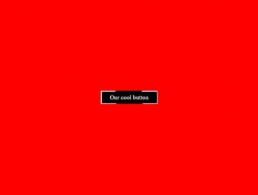
Let’s add styles t our custom button:
.btn-custom {
     background:  var(--blue);
     background: var(--gradient);
     color: #fff;
     border-color: var(--blue);
 }
 .btn-custom:hover{
     color: #fff;
     background: var(--blue);
     background: var(--gradient-hover);
 }
The background color is the same as we use for the scrollbar, and for the hover state, the colors are determined in the root.
If you check the current design you will notice that the profile picture is huge, let’s fix that.
The profile picture element has a class user-img.
Let’s decrease the size to 2 rem;
.user-img {
     width: 2rem;
     height: 2rem;
 }
The design looks much better now:
The next step should be side navigation:
.sidebar{
    background-color: var(--sidebar-bg-color);
     transition: margin 0.25s ease-out;
     -webkit-transition: margin 0.25s ease-out;
     -moz-transition: margin 0.25s ease-out;
     -ms-transition: margin 0.25s ease-out;
     -o-transition: margin 0.25s ease-out;
 }
 .sidebar__nav {
 padding-left: 0;
 }
Transition is used for the margin, the transition will occur for the 250 ms and the transition timing for the slide out will be easy.
The side nav looks horrible right now, we will fix that by adding width to the sidebar list, some padding to make space around them, and setting the position to relative.
The position needs to be relative so we could style :: before and ::after pseudo-elements.
What I mean by that is the line to the right when we hover over the list.
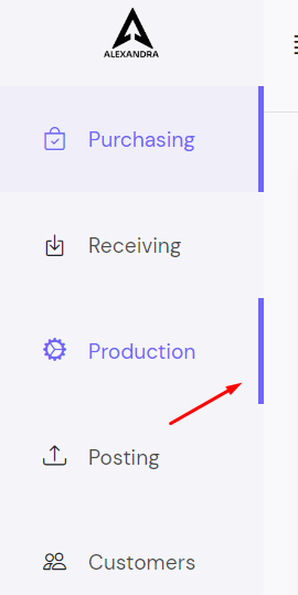
Here is the code for the list and the link:
.sidebar__list  {
     width: 15rem;
    list-style-type: none;
    padding: 2rem 0 2rem 2.5rem;
    position: relative;
  }
  .sidebar__list:hover i {
     color: var(--blue);
  }
  .sidebar__list:hover a {
     color: var(--blue);
  }
  .sidebar__list::before{
      position: absolute;
      content: '';
      right: 0px;
      top: 0;
      height: 100%;
      background-color: var(--blue);
      transition: all ease-in .2s;
      -webkit-transition: all ease-in .2s;
      -moz-transition: all ease-in .2s;
      -ms-transition: all ease-in .2s;
      -o-transition: all ease-in .2s;
      transform: scaleX(0);
      -webkit-transform: scaleX(0);
      -moz-transform: scaleX(0);
      -ms-transform: scaleX(0);
      -o-transform: scaleX(0);
 }
  .sidebar__list:hover::before{
     transform: scaleX(1);
     -webkit-transform: scaleX(1);
     -moz-transform: scaleX(1);
     -ms-transform: scaleX(1);
     -o-transform: scaleX(1);
     background-color: var(--blue);
     width: 5px;
     height: 100%;
     -moz-transform: scaleX(1);
     -ms-transform: scaleX(1);
     -o-transform: scaleX(1);
 }
 .active {
      background-color: var(--active);
      border-right: 5px solid var(--blue);
  }
  .active:hover {
     border-right: 0px;
  }
  .active i {
      color: var(--blue);
  }
  .active a {
     color: var(--blue);
  }
  .sidebar__link {
      font-size: 1.2rem;
      margin-left:1rem;
      text-decoration: none;
      color: var(--text-lighter);
  }
  .sidebar__list i {
      font-size: 1.3rem;
  }
When the sidebar list has hovered the icon and the link are blue.
With sidebar__list::before we set the size, width, background color, and animation which will occur when you over the list element.
With sidebar__list:hover::before we set the width, height, and size of the border when the list element is in a hover state.
scaleX(0) to scaleX(1) will increase the size of the element on X axis.
Lastly, in the sidebar, we need to style the links and icons.
I don’t need to explain anything here I guess.
.active {
      background-color: var(--active);
      border-right: 5px solid var(--blue);
  }
  .active:hover {
     border-right: 0px;
  }
  .active i {
      color: var(--blue);
  }
  .active a {
     color: var(--blue);
  }
  .sidebar__link {
      font-size: 1.2rem;
      margin-left:1rem;
      text-decoration: none;
      color: var(--text-lighter);
  }
  .sidebar__list i {
      font-size: 1.3rem;
  }
We are done with the side menu.
Next is the main content part.
We have here:
#page-content-wrapper {
    min-width: 0;
    width: 100%;
 }

 .top-search {
    width: 40rem;
}
 #wrapper.toggled .sidebar {
     margin-left: -15rem;
 }
Page content wrapper should have a width of 100% to fit nicely.
The search bar at the top of the website is small, let’s increase its width.
When the wrapper which is the top-level div is clicked we add a toggled class using javascript. Then we set the sidebar left margin to -15rem.
The javascript for the toggle button:
const el = document.getElementById('wrapper');
const toggleButton = document.getElementById('menu-toggle');


toggleButton.addEventListener('click', () => {
    el.classList.toggle('toggled');
});
The wrapper is the top-level div, the menu-toggle is the bars icon in the top left of the main part.
When the bars icon is clicked we add a toggled class to the wrapper and vice versa.
After that, we set the menu toggle icon cursor to the pointer, and increase the font size to 1.7rem.
We also add a little bit of padding to the main part to make some space around it.
#menu-toggle {
    cursor: pointer;
    font-size: 1.7rem;
}
.main-part {
    padding: 10px !important;
}
There is only left styling for the table and for the mobile view.
The images in the table are huge and the first step is to reduce their size.
With object fit set to cover images will fit nicely.
The list is a little bit squeezed and there is no border currently, It would be nice if add some.
.product-img {
    height: 3rem;
    width: 3rem;
    object-fit: cover;
}

 .dataTable thead tr th {
    padding: 8px;
    border-bottom: 1px solid #666;
}
.dataTable tbody tr td {
    padding: 8px;
    border-bottom: 1px solid #EFEEF9;
}
And finally, come to the last part styling for the small screens.
@media (max-width: 768px) {
    .sidebar {
        margin-left: -15rem;
    }
    #page-content-wrapper {
       min-width: 100vw;
    }
    #wrapper.toggled .sidebar {
        margin-left: 0;
    }
    .main-part {
        padding: 10px !important;
    }
    .gear-btn {
        margin-top: 20px;
    }
}
The sidebar is not visible on the screen for small devices by default. After the menu-toggle icon is clicked sidebar menu shows on the screen.
We also decrease the main part padding to 10px and we add some margin for the gear button to show it under search input.
The source code: